Thursday, February 27, 2014

Celtic knot: Infinity or something something...


Oh hey, so I made a knot. A Celtic knot.  Out of wood.  Typically, when one is making something as immutable as a wooden wall hanging symbol, the underlying meaning should be at least topically investigated.  However, not wanting to invest the 15 seconds of a Google search, I shall let it remain a mystery to me.  I think it probably has something to do with infinity... or racial tension...or something...

Anywho, this guy took me a while to complete.  I wanted to give it some depth as if the wood were going over and under itself.  So after a good deal of painter's tape, Vaseline, spray paint and time, I give you the Celtic Knot of Ambiguous Meaning.

Tuesday, February 18, 2014

Mustard Yellow!!!

While in this picture it very much looks like gold,  I nevertheless got some mustard yellow paint--booyah!  (Disclaimer: I would not advise consuming actual mustard at any point--ever.  Very toxic.  Very disgusting.  Very yellow.)  I've been wanting to justify buying more paint, and a customer's request settled it.  I kinda want to go paint everything yellow now.  How utterly pleasing.
PS- This little number is distressed with a medium chestnut under the yellow. 

Tuesday, February 11, 2014

Finished Finishes

I finally finished my finishes collage...   DARN.  There's no synonym for collage that starts with an F...  Alliteration fffail.

Tuesday, February 4, 2014

Font Ideas

{We interrupt the usual tone of this blog to post some font options linked from Etsy.}

Etsy folks, some things to keep in mind when selecting a font:
  •  The thinner the font style, the weaker (easier to break) the finished product will be.  While I can cut pretty thin fonts, we should both worry about the finished product making it to you in one piece after shipping (despite a plethora of bubble wrap and a mail carrier with the best intentions of caution).
  • Words containing certain letters that hang below the "line" (such as lower case "y" "g" "q" "p" and "j") will not stand up evenly on a flat surface on their own (but would still be dandy hanging on a wall).
  • Cursive-type fonts typically don't look great in all capital letters (like if you're trying to avoid that lower case 'y' messing things up).
  • Letters will be scooted closer to each other so that an entire word can be cut out in one chunk (unless you're wanting individual letters cut separately).
  • I can do just about anything from fontsquirrel.com or dafont.com as long as it's a thick enough font and listed as "free" or "public domain" on dafont.  (Everything is free to use on fontsquirrel.)  Just keep the above bullet items in mind when selecting :)
  • Below are some ideas of fonts that would work well:

Fer fun!


Pine Plus Polymer Pandemonium


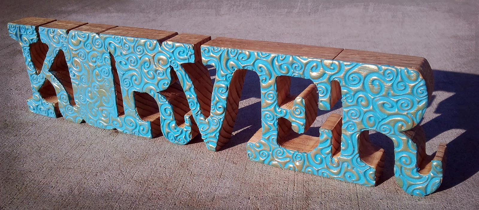
Ah, texture.  I'm a big fan.  So I slapped some polymer on this wooden name cutout and Danish oiled the exposed wood.  I'm always a little sad to paint or otherwise cover the wood, since I think wood grain is art in and of itself (go God), so this is a happy medium.  Pine & polymer, salt & pepper, me & mini Reese's... the list goes on.


Korver is my awesome neighborfriend's son.  So this one was for him.  While I don't think it's HORRIBLE to not have the middle of the O and R's cut out, I'm pretty happy that my new scroll saw can make inside cuts with ease.  Perhaps I should consider a career in Dewalt sales...


So then, I was like, "I think this is cool, maybe other people would, too..." So this became my first Etsy listing.  It's super hard though to narrow down the -here's what poly clay finishes are available- when there are virtually endless possibilities.  So I'm working on a good way to convey that in just a couple pictures and pull-down options.  Too many options hurt my brain...